You don’t need to be a UX engineer to know how a user experiences your organization online matters. In this digital age, online interactions are often the primary avenue your organization has for building trust with supporters.
It’s time to leave behind the transactional model of fundraising and step into the relational model of trustraising. This includes revamping your donation page to be a gateway for supporters to have a real-life impact.
Keep reading to learn…
- What user experience is all about
What Is User Experience?
User experience (UX) is how a user interacts with and experiences a product, system, or service, including a person’s perceptions of utility, ease of use, and efficiency.
The decisions you make in design impact how a user feels when interacting with your organization online. This includes your website, donation pages, member portals, sponsorship management, merch store, apps, and everything in between.
Improving User Experience Of Your Donation Pages
Today, we’ll be honing in on how to improve the user experience of one of the most important pages nonprofit’s create online: The donation page! Why? Your donating experience is the bridge that connects inspired supporters to the real-life impact they want to have.
Intentional and strategic user experience has the potential to raise conversion rates by as much as 400%. So, what are you waiting for? Empower your supporters to step boldly into impact as you improve the online fundraising experience of your donation page!
6 Easy Ways To Enhance The Donation Page User Experience
#1: Make It Easy To Find
Include a punchy, short call-to-action (CTA) button in your mobile-optimized website header and footer (“Donate Now” or, “Help Change Lives”). You can also add your CTA to multiple other pages to reinforce the option to donate with a button that stands out (e.g., bold color or size). Helping donors navigate to your donation page faster removes friction from their user experience.
#2: Use Icons And Visuals
Use icons to make reading your donation page easier. Highlight payment methods and donation options with icons, so supporters can quickly scan your donation form. Make sure your progress buttons are clear and easy to find as well (e.g., “next, review, confirm”).
#3: Simplify To Magnify
Get rid of any distractions on your donation page and instead focus on demonstrating impact.
Use:
- Simple headers and footers
#4: Think Through The Journey From Start To Finish
The donor experience is not done once supporters have made their contribution!
Include a simple but personal thank you message. Ideally, this is a thank you page that pops up after a donation is complete to confirm and acknowledge their contribution, followed by a thank you email with a receipt sent immediately after. This kind of donor appreciation will help supporters feel good about their decision to make a donation, enhancing their user experience.
#5: Provide Next Steps
After supporters give, they’re often thinking, “Now what?”. This is a great opportunity for you to strengthen their relationship with your organization! Include social buttons to follow you online, an option to subscribe to newsletters or email updates, or a fun video that shares more about your organization on your thank you page so your donors won’t miss a beat.
#6: Test, Test, And Re-Test
Take time to perform usability tests as often as once a month to see how things are going. This can be as simple as going through the donation experience yourself, or running a small focus group.
This doesn’t have to have to be a big lift! 85% of issues related to UX can be detected by performing a usability test on a group of 5 users. Gather small focus groups to go through your donation page. Observe their experience and record their feedback.
We Understand How Important The User Experience Is
Nonprofits are not the only ones that need to consider a user’s experience – all organizations should! Even the smallest language changes can have a big impact, and it’s important to consider how those changes will impact users.
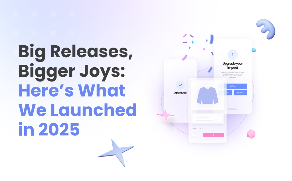
Our team is always looking for ways to improve your experience with our product—that’s why we’ve rolled out a brand new look and feel. See how we’re making Givecloud easier than ever to use!